content
(<=== width ===>)
Some HTML and CSS Fundamentals
Last Updated:
Jeffrey Knauth
This document describes some of the basic concepts of HTML (HyperText Markup Language) and CSS (Cascading Style Sheets), two programming languages which are used to create web pages. References at the end of the page provide much more information, including examples. It's important to understand that although HTML and CSS contain MANY facilities, you can produce very useful web pages by using just a small subset, e.g., the structuring tags and styling properties mentioned below. They were used to create the web page you are now viewing. The main objective of this document is to show how things fit together for such a page.
(click to jump to a section)
(click to jump to a section)
Contents
- A source file is used to produce a web page
- Source file sections: body (data) and head (styling)
- HTML elements produce boxes
- Box nesting: tree structure and familial relationships
- Inheritance arises from box nesting
- Cascading and specificity: element property values
- Examples of dynamic effects
- Case and spacing considerations
- Some things not covered
- Steps to create a web page
- References
- History of significant changes
A source file is used to produce a web page.
The source file for a web page is a text file with an .htm or .html file extension, e.g., myvacation.htm. The .htm and .html file extensions are equivalent.
- The source file is created and maintained with a text editor, e.g., Notepad, Notepad2, or Notepad++.
- It is viewed with a browser, e.g., Mozilla Firefox, Microsoft Edge, or Google Chrome.
The source file is usually on some website server accessible via the internet. However it can instead just be on your PC. Usually that's where it will be while you are developing the web page (source file) and viewing that local file with a browser on the PC during testing. Then when the file is deemed ready to go, it can be uploaded to a website.
However, putting the file on a remote website is not required. The file can be very useful if just viewed locally, either on your own PC or provided to someone else to view on their PC, tablet, phone, etc. Maybe you send them the source file via email or have it on a flash drive -- no remote website required. I'll still call the result a web page even though it can be used completely apart from the internet.
Actually, a web page might involve multiple files, as described below. Such files can provide styling controls, text, images, videos, independent web pages, etc. These can be spread across multiple locations, local and remote. However the main file is the source file; it links to the other files. It is the anchor for its web page and is the focus of this document.
The source file has two major sections: body and head.
The body contains your (structured) data. The head contains control information to format (style) your data. The code below for a skeleton web page shows how the sections are organized in a typical source file.
A <!DOCTYPE html> statement is put at the top of every HTML5 source file to tell the browser that this source file is expected to follow HTML5 standards. The lang="en-us" in <html lang="en-us"> means the source file is written in US English. You can (and should) include comments in the source file to help with future maintenance; comments are ignored by the browser. Comments have two different formats, depending on where they are located in the source file. Comments in a style section look like this: /* ... */. Elsewhere, e.g., in the body section, comments look like this: <!-- ... -->. In the source file image below I have colored the comments red and highlighted the content areas with a white background. Your text editor probably would display these differently. Also, for this tutorial display, I added background colors for the file, head, and body sections; those special backgrounds would not be seen in a text editor.
Later sections in this document will describe HTML tags and styling rules. For example in the code below, body {background: #DEE;} makes the body's background color light-green-blue. (CSS provides many ways to specify colors, from simple names like "red" to complex terms like "#CF360E50".) The defaults for most CSS properties are fine, but you can specify your own settings to get exactly what you want.
<!DOCTYPE html>
<!-- you can put comments here, but only AFTER the DOCTYPE statement -->
<html lang="en-us">
<head>
<title>Colorful Animals</title> <!-- this text goes in the page's browser tab -->
<style>
body {background: #DEE;} /* format page's body */
h1 {font-style: italic; text-align: center;} /* format page's main heading */
li#dog {font-weight: bold; color: red;} /* format id="dog" list item */
/* format class="emppara" paragraphs */
p.emppara {color: blue; width: fit-content; margin: auto; font-weight: bold;}
</style>
<style media="print"> /* these overriding rules take effect only when printing */
p.emppara {color: white; background: black; padding: .5em;}
</style>
</head>
<body>
<h1>Colorful Animals</h1> <!-- main heading will use special formatting -->
<p class="emppara">Take note.</p> <!-- special formatting for "empara" class -->
</html>
<!-- this paragraph uses default formatting -- has no specific rule in style section -->
<p>Here are my recent sightings from around the worst affected areas:</p>
<ol> <!-- creates an ordered list with no special "whole list" formatting -->
<li>Purple cows</li> <!-- this list item will use default formatting -->
<li id="dog">Green dogs</li> <!-- special formatting for id="dog" list item -->
<li>Pink snakes</li> <!-- this list item will use default formatting -->
</ol>
<p class="emppara">BEWARE!!!</p> <!-- special formatting for "empara" class -->
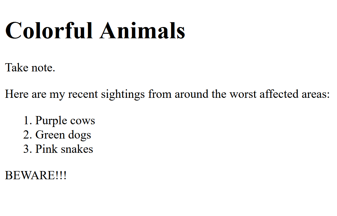
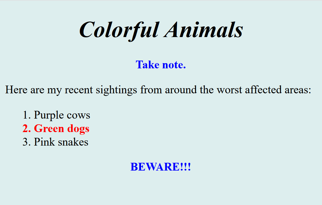
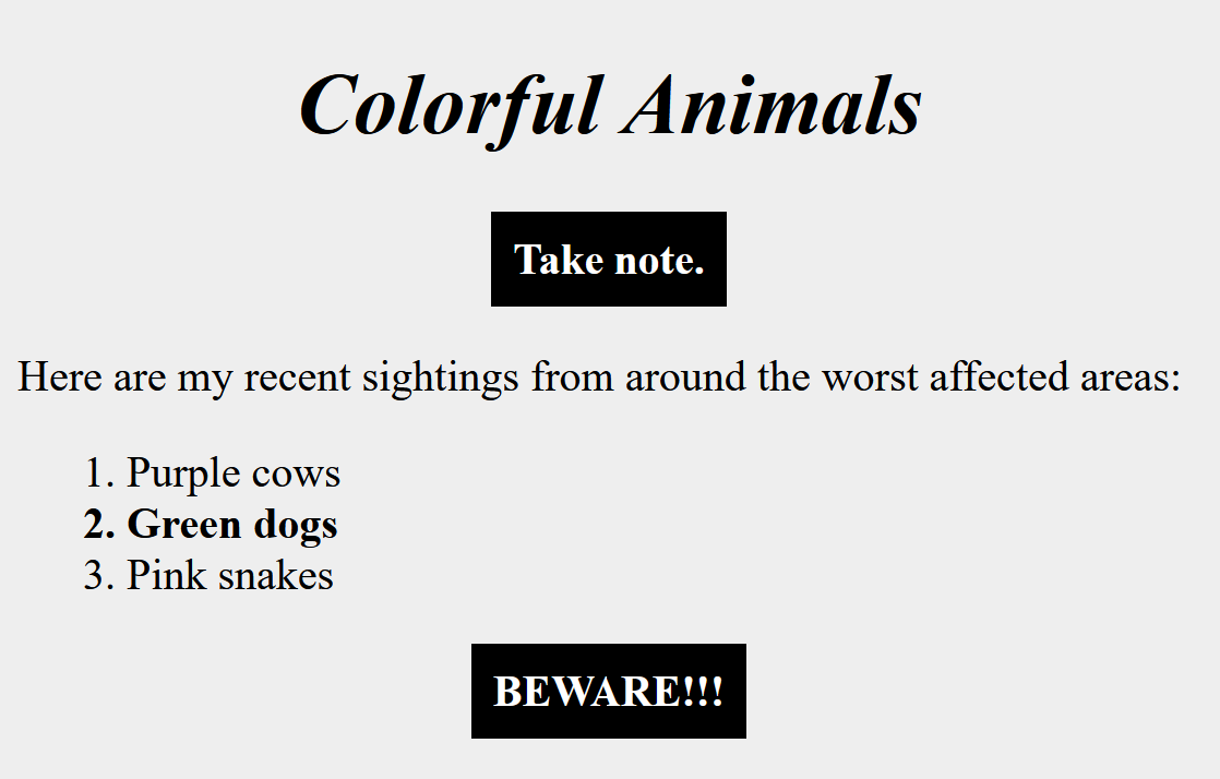
</body>If there were no style sections in the above source file, i.e., use default formatting, the file would display like the image on the left. With the above style sections, on a screen it would display like the center image and, when printed on a black and white printer, the output would be like the image on the right. Note the special (overriding) style applied to the first and last paragraphs when the page is printed instead of displayed.
The body section contains your data, i.e., the information you want to convey.
The data is structured as elements, e.g., headings, paragraphs, lists (ordered and unordered) consisting of list items, tables with rows and with cells in the rows, divisions for grouping other elements, spans to designate areas for special formatting, anchors (e.g., links to other documents), preformatted areas, and images.
To do the structuring, HTML tags are used to delimit elements. These tags have a paired begin tag and end tag, e.g., <p> and </p>, with the element's data in between, e.g., <p>This is my paragraph.</p>. For some special tags, whose elements contain no data to delimit, the two tags are combined into a single begin-end tag, e.g., <hr />, <img />, and <br />.
Here are some examples of HTML start tags, which produce the types of elements listed in the paragraph above. Each of these (except <img />) has a paired end tag, </...>. Also listed are the basic document structuring elements (html, head, body, and style) shown in the above skeleton file.
Start tags can be modified with attributes, e.g., class, id, and style. These attributes have values, e.g., <p class="warn">, <div class="sway emp">, <li id="zebra">, <li id="hippo" class="endangered">, and <span style="color: orange;">.
The names after class and id indicate which rules in the head section are to be used to style the associated elements in the body section. Any number of elements can be in the same class, e.g., many <p class="warn"> paragraphs might be styled by a p.warn {color: red;} rule. The id attribute works similarly, but id names must be unique; so there can be only one element with an id of "zebra". If it is <li id="zebra">, that element might be styled with a rule such as li#zebra {font-weight: 700;}. Note that in selectors, "." is used for classes and "#" is used for ids.
The head section is used to style/format the elements in the body. It has rules specifying how designated elements are formatted, including the following types of styles and many more:
color of text
text alignment
background
margins
paddings
borders
width
height
font family
font style
font size
font weight
float
clear
list style type
positioning
visibility
box shadowing
text shadowing
white space
A rule consists of a selector and one or more declarations, where each declaration is a property followed by a value, as shown in the diagram below. The selector specifies the element(s) in the body to which the declaration(s) apply, e.g., which paragraphs should have the styling specified by the declaration(s). The properties and values of the declarations specify the styling details to be applied to the selected element(s), e.g., text color is brown and font style is italic. The selectors can be simple or can be quite complex to pinpoint a subset of elements.
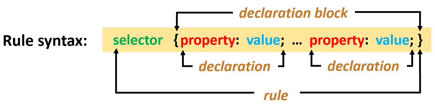
Aside: The above diagram is an <img> using a
picture created with Microsoft PowerPoint. I also made a similar
diagram using only HTML/CSS characters, but that is very cumbersome. I
tailored it for PCs, on which it displays pretty well. For other
devices it is a mess and I didn't bother to try to fix it for them.
FYI: (PCs only) Hover the cursor here to display
an HTML/CSS version of diagram.
┌──────────
declaration block
────────┐
│
│
Rule syntax: selector
{property:
value; ...
property:
value;}
│ └─
declaration
─┘ └─
declaration ─┘│
└────────────────────
rule
────────────────────┘
Examples of rules (with syntax
parts colored to match above diagram)
p
{color: brown;
font-size: 90%;
font-style: italic;}
span.term {background: tan;}
p#warn {color: red; font-weight: bold;}
ul li {margin-bottom: 1em;}
div > p.may span {background: cyan; padding: .2em .3em;}
a:hover {color: white; background: blue;}
*.shade {background: #CCC;}
span.term {background: tan;}
p#warn {color: red; font-weight: bold;}
ul li {margin-bottom: 1em;}
div > p.may span {background: cyan; padding: .2em .3em;}
a:hover {color: white; background: blue;}
*.shade {background: #CCC;}
Rules are grouped into style sheets. Multiple style sheets, coming from multiple places, can apply to formatting a web page. For example, in addition to style sheets in the web page's head section, the page can link to other files and import style sheets from them. Also, the browser as well as the browser user can specify style sheets. Which rule is actually used for an element involves cascading, specificity, and inheritance, which are discussed in sections below. Details about selectors and declarations can be found at MDN and W3Schools; see References.
HTML elements produce two-dimensional boxes.
Each element box has the sort of structure shown below on the left. An example is on the right.
margin
border
padding
(<=========== NOT width ===========>)
This is a paragraph with some padding, a border, and a margin to keep it away from the edges of the containing division.
This is a division =========>
It contains one paragraph,
which has this background
and is surrounded by padding
and then a thick border
and then the margin, which
uses the background of the
container, the division.
It contains one paragraph,
which has this background
and is surrounded by padding
and then a thick border
and then the margin, which
uses the background of the
container, the division.
The padding, border, and margin of an element have four sides: top, right, bottom, and left. The size of each side of each property can be specified independently and can be 0, i.e., not present.
- The content area contains your data, e.g., text.
- The optional padding around the content provides some space around the content. It has the same background as the content area.
- An optional border can be around the padding. It has an independent thickness, color, and border style (solid, dashed, dotted, double, etc.)
- The optional margins around the border separate this element from the edges of adjacent or containing elements. The margin area has the same background as the element containing the element in question.
In the following, two boxes are adjacent if they are beside each other, either horizontally or vertically, with no other boxes in between. In contrast, a child box can be contained in a parent box and have no other boxes between a side of the parent and a side of the child. Then the margin in question is between those two sides. (See the next section on tree structures for explanations of child and parent.)
- Adjacent boxes have a shared margin.
- Adjacent left and right margins are added to get the final horizontal margin between the boxes.
- Adjacent top and bottom margins collapse -- the larger of the two is the final vertical margin.
- Negative margin values are allowed. Generally, the sum is the final vertical or horizontal margin.
- Warning: If a parent element has no top border or top padding, things are more complicated for the top margin of its first child (not detailed here). If a top border or top padding (of even one pixel thick) DOES exist, things work "normally" and the margin is between the top side of the child and the inner edge of the parent's top padding, or the inner edge of the parent's top border if there is no parent top padding.
Nesting produces a tree structure and familial relationships.
Nesting of boxes is fundamental to HTML, e.g., a division box might contain boxes for headings, paragraphs, ordered lists, and other divisions. The paragraphs might contain spans. The ordered list contains list items, which might contain unordered lists, whose list items might contain spans, etc. -- boxes within boxes within boxes... . It is important to note that intersecting boxes are NOT allowed, i.e., where one box is only partially within another.
Box nesting can be viewed as a simple family tree, as shown in the example diagram below. Each node (box), e.g., division 1, contains all the nodes (boxes) reached by going down paths from it, e.g., image 1, division 2, paragraph 5, list item 2, and others. All such items are in division 1's nest of boxes, although at different levels of nesting.
To understand some terminology, focus on the ordered list element in the diagram. Follow the paths to/from that element using the list below the diagram.
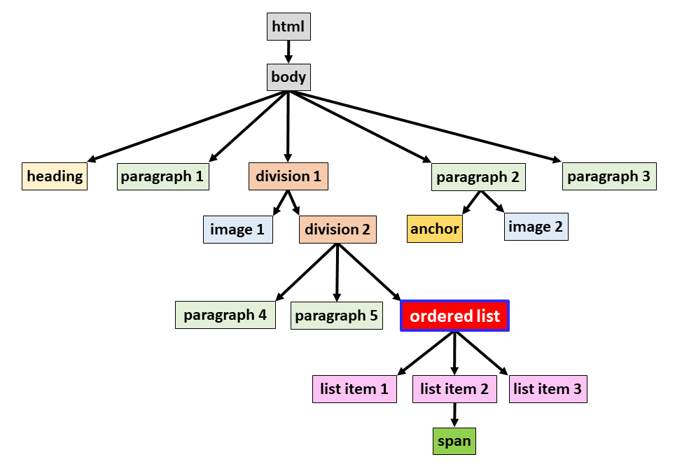
- The ordered list is a child of division 2 (it is on a path down from division 2 and is exactly one level below it).
- Division 2 is the parent of the ordered list (it is on the path up from the ordered list and is exactly one level above it).
- Division 2, division 1, and body are ancestors of the ordered list (they are on the path from it going up the tree).
- The three list items and the span are descendants of the ordered list (they are on some path from it down the tree).
- Paragraph 4, paragraph 5, and the ordered list are all children of division 2 (they are all exactly one level down the tree on a path from division 2).
- Paragraph 4, paragraph 5, and the ordered list are siblings (they have the same parent).
- List item 1, list item 2, and list item 3 are children of the ordered list, but the span is not since it is one level further down.
Box nesting leads to inheritance.
Many properties of an element can be inherited by its descendant elements. The descendant elements can be multiple layers deep, e.g., <div>...<ol>...<li>...<span>xyz</span>...</li>...</ol>...</div>. Even though the span is a distant descendant of the div, it can inherit certain properties from the div, e.g., color and font-style, if those properties are not declared directly by a rule for the span or by a rule for any element between the span and that div.
Cascading and specificity dictate which property values apply to an element.
Cascading and specificity control which declarations (property/value pairs) are specified directly for each element in the body. The declarations for that element's property may have been listed in multiple rules in multiple places. Multiple types of selectors may be involved -- some more directly specifying the element in question than others. Every one of the associated declarations could potentially apply, but only one can win for a particular element's property/value. It can get complicated to determine which one of these rules is the winner for a particular element's particular property.
Roughly CSS cascading works like this: Style sheets can come from multiple sources (origins), e.g., from the browser (these are the main defaults), from the browser user (if the browser provides a way for the user to do this), and from the web page author (usually the desired source for non-default settings). If an origin provides multiple style sheets, they are merged in the order encountered to provide a single style sheet for that origin.
Determining element property values is done one element at a time and then one property at a time for that element. If a rule has multiple declarations, it is logically split into multiple rules in the style sheets, one declaration per rule and with the original selector used for each of these rules. In the following the only rules considered at this stage are those related to the element in question and to the property currently being evaluated; the other rules are ignored for now.
If there is a contest within an origin's merged style sheet, i.e., more than one of the split, single-declaration rules might apply, only the most specific selector's rule is kept for that origin. (There is an algorithm to assign a specificity weight to a rule, e.g., the weight for a rule with an id is larger than the weight for a rule with just a class which is larger than the weight for a rule with no id or class). If there is still a tie (multiple rules in the style sheet with the same high weight), just the last appropriate rule in the style sheet is kept; the search order used for this is top to bottom in the sheet. By now in the process there are only a few rules left, at most one from each origin. The final winner is based on the rule's origin, with the preferred order being first the author's rule, then the browser user's rule if the author's style sheet has no appropriate rule left, then finally the browser's rule as a default if there is no other rule left for the element and property in question.
There are other considerations, e.g., the "important!" setting for a property, which overrides and inverts some preferences; it is recommended to stay away from using this. You can also specify properties directly on tags by using the style attribute, which takes precedence over everything; however it is recommended to use CSS rules in the head section to do such styling in almost all cases.
There are other CSS facilities, which you will probably never use -- layers, at-rules, etc. They further complicate things, but are useful to professional web designers who have to deal with web sites having many complex pages. The designers can use these facilities to help present a uniform appearance across the site.
CSS can create some dynamic effects.
When you hover the mouse cursor over an element, CSS can change the web page. After first positioning the page (see below), carefully hover the cursor over each of the green list items, leaving the cursor in place until the effect completes. The third item's effect takes about seven seconds; be patient, then move the cursor away.
|
To position the page to best display the effects, first
click here. (On some devices you
may then need to scroll down a few lines to bring all three
list items into view.) Then hover on each item in
turn.
|
|
| A simple effect | (ho hum) |
| A dramatic effect BOO! | (yikes!) |
| A VERY dramatic effect WHO?! | (someone failed anger management class FOUR times!!!) |
(These effects didn't even use audio, haptics, or olfactory facilities -- stay tuned!)
HTML and CSS care about case, but not spacing.
- Case matters in tags, attributes, names,
properties, and values.
This is not strictly true for all situations with HTML (in contrast to XHTML), but it's better to assume it is always true. - Extra spacing is ignored between "words".
- Use to create a required space.
- is an example of a character entity.
- For many others, see the left sidebar of HTML Character Sets (you may have to widen the window).
- Line breaks (new line characters) are treated as spaces.
- Use <br /> to create a new line character, i.e., to start a new line in the formatted output.
- You can use the <pre> tag or various white-space property values to give you direct control over such space and line break situations for a region of the webpage. Then you, instead of the browser, do the formatting for that region.
Here's some of the fancier stuff I didn't cover.
Either I didn't mention them at all or I didn't give details about the following items; however many of them were used to create this page. You can look at the source file for this page to see how they were used. My more detailed text on HTML and CSS has more information on most of those in the table on the left. The commonly used items are listed first in that table; the facilities used to produce the "frills", e.g., the angry "WHO?" block, are at the end. The table on the right lists some other interesting HTML and CSS items that are worthwhile investigating eventually, but none of them were used to create this page. See the MDN and W3School references below for full details on all the items.
| Used To Create This Web Page |
|
| Not Used To Create This Web Page |
|
Steps To Create a Web Page
Here's how I typically create a new web page.
- Use a text editor to write the content in rough form. For example I create the headings, paragraphs, and lists I eventually want, but without indenting, list markers, or other such styling.
- Insert this text in the body section of a skeleton .htm file.
- Add HTML tags to formalize the structure, but still with no styling.
- Now start putting rules in the head section, adding class and id attributes as needed to the HTML tags.
- Do this styling addition a little at a time, viewing the file with my browser as I make changes to see if things appear as I want. See the paragraph below for why "a little at a time" is important.
- As I observe the effects of my style editing, I may decide to change my content or its structure to better get my thoughts across.
- Iterate. In each edit/view cycle, don't forget to do a save with the editor and a refresh with the browser to be sure I'm actually viewing the changes I just made. Also, be sure I'm actually viewing the source file I just changed, e.g., I'm viewing the file I edited on my PC, not the unchanged file on my web server. (Why isn't that change working?! Duh!)
As I do this iteration, I will often make mistakes: typing a ";" instead of a ":", or I forgot to provide an end-tag or "}", or something is mis-spelled, or the property value is wrong, etc. Fortunately these are usually easy to find and fix if I made the editing changes just a few at a time -- when things go wrong, it is probably because of the last change I made. As I go along I usually check HTML/CSS reference material to learn about new facilities or to remind myself about details for things I have used before. I also use tools built into my editor and browser that catch many syntax errors. Toward the end, I check if there is anything special I need to do for things like printing.
References
- My more
detailed text on HTML and CSS
(This is more detailed, but it's just black and white text and stick diagrams -- no pretty pictures.) - My more
detailed examples of HTML and CSS
(This contains many examples: "This is what you get when you use ...") - Some
very simple examples
(Examples of paragraphs, lists, etc., with the producing HTML/CSS code displayed in a section below.) - MDN (Mozilla Development Network)
(References and Guides -- in depth material.) - W3Schools --
HTML and
CSS
(Tutorials and reference material.) - Stack Overflow
(Google searches for HTML and CSS answers often list articles/discussions on stackoverflow.com.)
History of significant changes
- 6/13/24 Here: Added "optional" to the padding, border, and margin descriptions, to clarify the "can be 0" in the text above.
- 6/14/24 Here: Added a warning and some explanation about the top margin for first child elements.
- 6/17/24 Here: Removed the border from around the "margin" block in the center explanation; tweaked text.
- 6/17/24 Here: Corrected a division reference in the second paragraph; centered the image.
- 6/17/24 Here: Added "images" to the "Used To Create This Web Page" table.
- 6/20/24 Here: Added "indenting" to the "Used To Create This Web Page" table.
- 6/20/24 Here: Improved formatting of the Contents section.
- 6/20/24 Here: Improved formatting of the References section.
- 7/02/24 Here: Added more information about possible location and distribution of a source file.
- 7/02/24 Here: Noted that comments are ignored by the browser.
- 7/04/24 Here: Added information about source filelocation.
- 7/04/24 Here: Improved the diagram -- added ordered list, provided better sample text and comments
- 7/04/24 Here: Made the angry "Who" box angrier. Happy July 4th!
- 7/07/24 Here: Added output images to show what the example source file would produce. Improved comments.
- 7/10/24 Here: Neatened the comments in the example source file to make the non-comments stand out better.
- 11/21/24 Standardized a:hover/focus/active order.
- 2/18/26 Changed HOME button code and headings code; improved page breaks.